Thursday, April 23, 2015

Shhh...

This is the album artwork for Dave Menzo's newest album Shhh...
It's an interesting project, it's created entirely with instruments checked out from the Ann Arbor Public Library. They have a substantial electronic instrument section that he frequented to make the album. I started with the illustration of the face, hand drawing, scanning and digitally finishing it. I worked up the "Shhh..." text the same way. A few pages of S's and a few more of h's whittled down to the best ones. The velvet and fur backgrounds were really fun to work with as well. They lend a distinct vibe to the whole thing. 

I've got a few digital projects in the works and I'm enjoying this process being a blend of hand drawing and finishing in PS. 


Sunday, January 11, 2015

Lady portrait

This is a portrait of the lady. It's on the smaller side, 8x8. I wanted to try loosening up a bit. I kept the face mostly tightened up to a higher level of detail but let the background be looser and unfinished. I also wanted to try sticking a little bit of color in like the dark blue in the hair.


Tuesday, December 16, 2014

Study Paintings

These couple paintings were studies or smaller projects. They each had something that I wanted to practice or work on. The compositions and lighting conditions are just shy of what I'd normally consider for a larger landscape painting. I normally try to go for a time of day gives more vibrant or interesting color or a composition that highlights an atmospheric effect. These aren't by any means awful or boring but they are a hair of a departure from what I ordinarily focus on. 

This one's focus was both the subtlety of the distant fog and trying to work in a more subdued color pallet. I've got a number of paintings of sunsets or subjects that have very vibrant color schemes I wanted to practice toning it down a bit. 

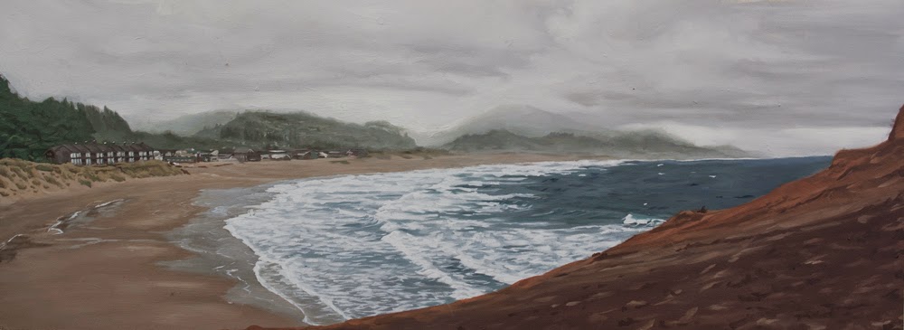
This one was also an attempt to work in a more toned down color pallet. Painting on a cloudy day with the more diffused and even light was interesting. The lighting was definitely not directional and had very few shadows to speak of. The red rocks can be very saturated and colorful in direct sunlight and in the other paintings I've done of them. I had to really try to keep them from getting too vibrant, while mixing the color I kept catching myself creeping in less neutral colors and brightening them up more than they actually appeared.

I'm also going to start taking these and/or my next few and working fantastical or sci/fi elements into them to take them from being just study paintings and make them illustration practice as well. Robots, dinosaurs, sub-terrearean desert worms, space ships, ghost ships from when the desert used to be the ocean. I've got a few ideas ready but if anyone has any interesting ideas I'm all ears, (there is a comment section below) basically nothing is to too ridiculous. The crazier it is the better it would be for me to practice integrating it smoothly.

Tuesday, December 2, 2014

Bananas!

This sweet hot mother of a painting that I posted the progress shots of is finished. I don't feel like there is that much to say, I was fascinated by the soft whites of the banana meat and thought the subtlety and texture would be interesting to paint. Also I thought that having a painting of bananas on your wall was kind of a hilarious idea. I get to enjoy them hanging in my house till they sell. 

The original is for sale on etsy:

And prints are for sale through society 6:


Monday, December 1, 2014

Shelter Cove

This is a painting of the sunset I stumbled upon on the drive down into Shelter Cove, CA. While heading in to a hotel there for the night the winding road down down down through the hills and cliffs popped out for a second on this. It looked like a sea of clouds lit up reddish and orange right at sunset. It was breathtaking. The real challenge was getting the corona of color around the sun, how it washes out color and obscures detail in that area was something I hadn't tried to this degree before. In person it wasn't quire this strong and in the photographs it was much stronger. I went with something right in the middle. The other part that I enjoyed especially was the sky, the indeterminate area where it's not reddish and it's not blue took a lot more subtlety than I expected. The area to the right with the gradation of blues as they recede in distance was also a fun challenge. 

The original is for sale on Etsy!

Prints are available through Society 6


Here are a few progress shots, taken with a phone unfortunately, while I'm in the middle of a painting I have a hard time making myself stop and get up to go get a real camera. Maybe on one of these next ones I'll set it up ahead of time and get better progress documentation. 


Wednesday, October 22, 2014

Zion

Finished painting from Zion National Park in Utah. I got a chance to drive out there for a whirl wind day trip with my roommate Mason a few months ago. I've been super into California Impressionists like Edgar Payne, Granville Redmond and John Marshall Gamble lately. This was a bit of a crack at that style of more distinct brush strokes, flattening out some areas of color and including how vibrant the colors can be with the effects light. Definitely a style I'll be trying to explore more of. 


Here are a few closeups


 And here are a few progress shots showing how it came along. 


Saturday, May 3, 2014

Dream House....

This is done and fresh in from the photographers. After having it finished for a while now it's nice to finally have a great quality image of it to post online. I'll be flying it up to Ann Arbor soon to drop it off with Dave Menzo and the fine gentlemen of the Dream House. 

For now prints are available here:
through the delightful on-demand printing services of Society6. 


Original is 43inx19in oil on panel. 


 Here are a few closeups to show the level of detail a little better.